Holocaust
Education Movie
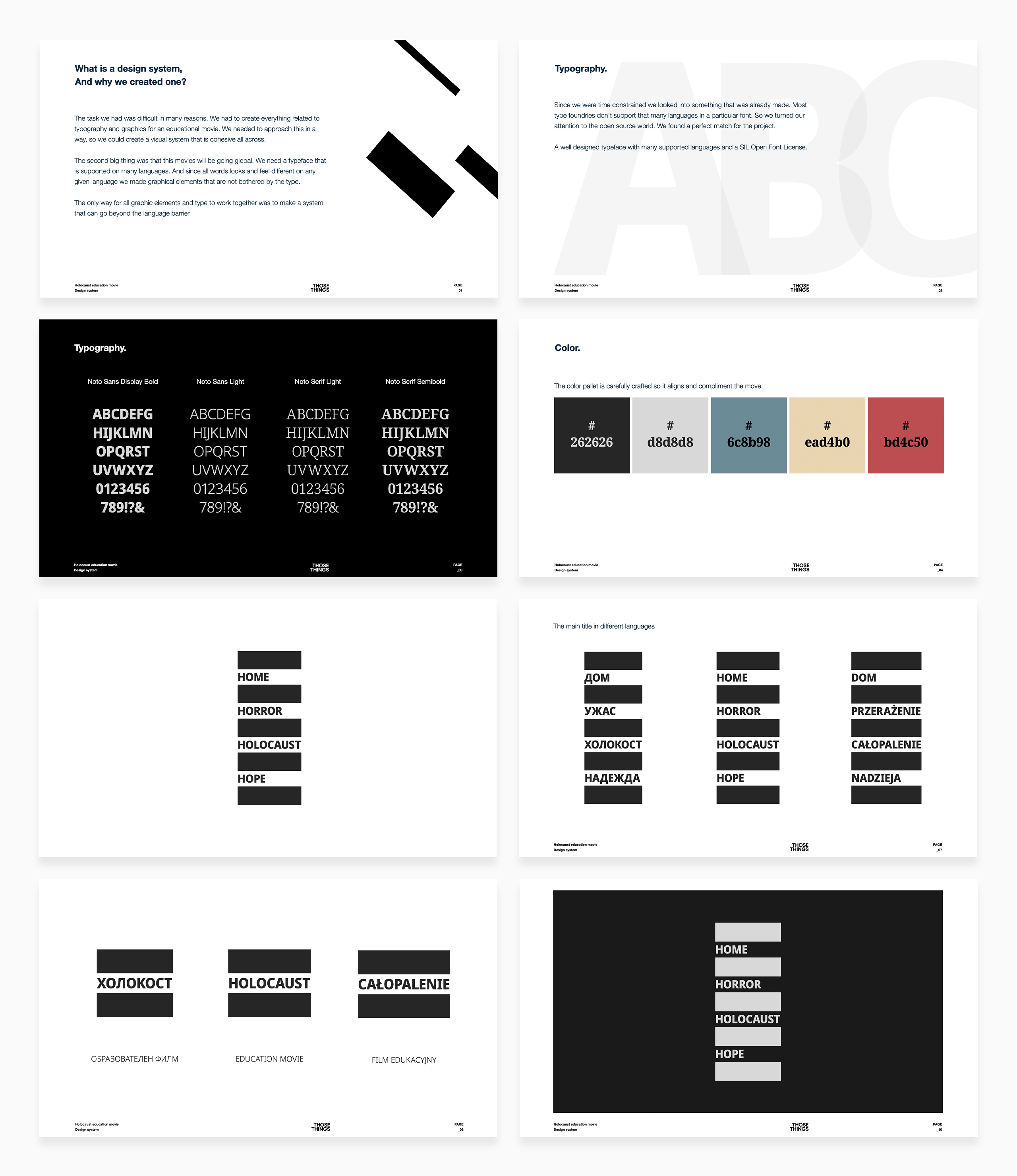
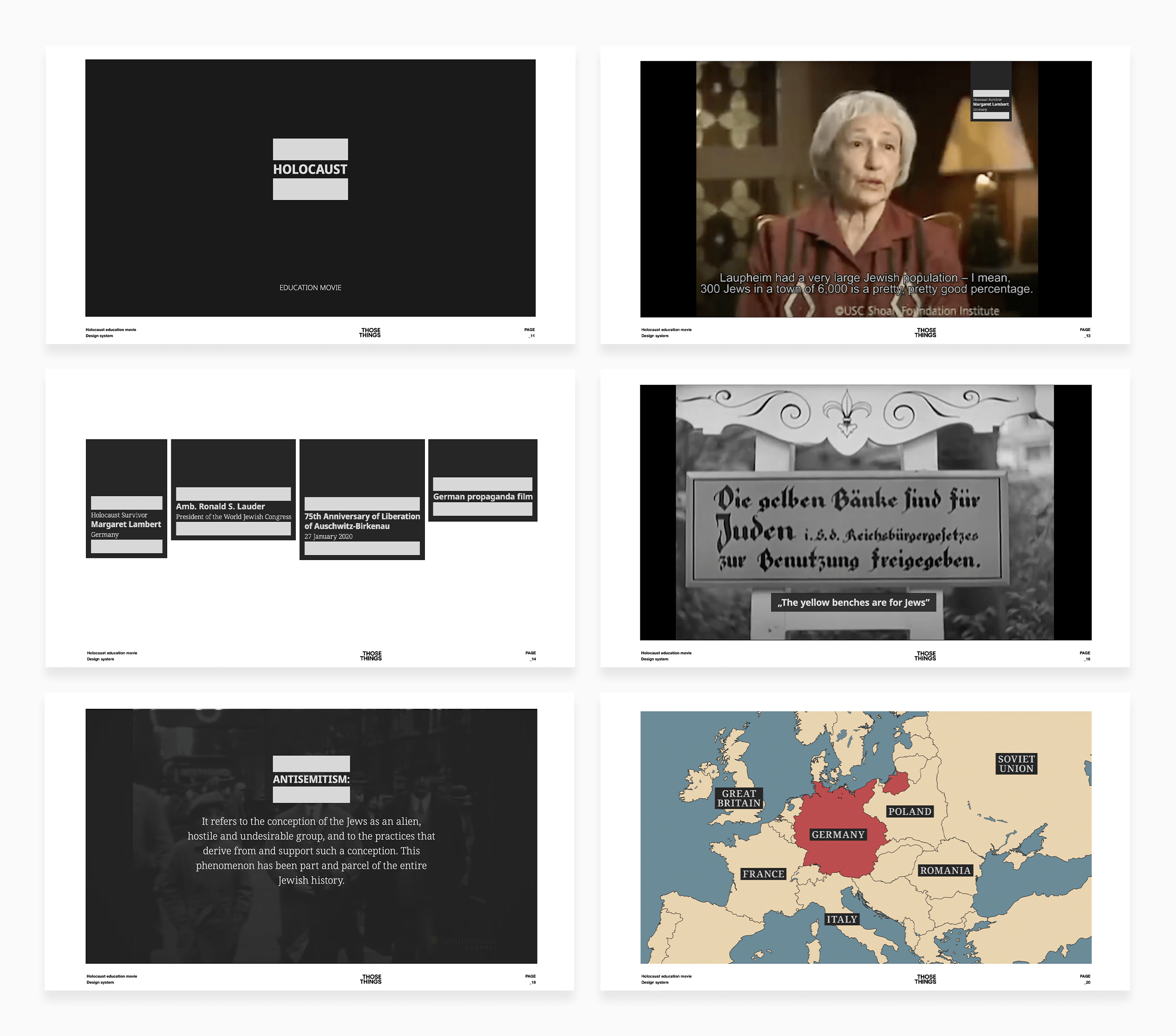
The task we had was difficult for many reasons. We had to create everything related to typography and graphics for an educational movie. We needed to approach this in a way that would allow us to create a visual system that is cohesive throughout.
The second big thing was that this movie would be going global. We needed a typeface in many languages. Since all words look and feel different in any given language, we created graphical elements that are not hindered by the type.
The only way for all graphic elements and type to work together was to create a system that can transcend the language barrier.
client: Four o Four
Scope of work: Design Direction, Brand Identity, Motion Graphics

